Nature-Inspired Web Design in 2026: Which Trends Have Evidence Behind Them?
By Amit Saini, founder of Vimana Digital · First published 16 February 2025 · Updated 23 October 2026
Nature-inspired web design uses earthy colours, organic shapes, natural imagery and restrained motion to make a site feel calm and trustworthy. In 2026 the trend overlaps with sustainable web design, which cuts page weight and energy use. The look is a choice; the lighter, more accessible build behind it is measurable and benefits any business.
What does "nature-inspired web design" mean in 2026?
When we first wrote this post in early 2025, the trend was mostly aesthetic: muted greens and browns, wavy section dividers, handwritten-style type, photos of moss and stone. Trend roundups for 2026 still describe it that way, now under labels like "biophilic design", "neo-naturalism" and "wabi-sabi UI" (daisyUI trends; Fairwind Creative, 2026). Those are agency opinions, not research, and we treat them as such.
What has changed is that three measurable things now sit underneath the look:
- Pages are getting heavier, not lighter. The median mobile home page weighed 2,559 KB in 2025, up 8.4% from 2.4 MB in 2024; desktop reached 2,862 KB. Images were the biggest share at 911 KB on mobile, then JavaScript at 632 KB (HTTP Archive, Web Almanac 2025, published 15 January 2026). A "natural" site that ships a 4 MB hero video is the opposite of what it claims to be.
- Sustainable design has a standard. The W3C Sustainable Web Interest Group published the Web Sustainability Guidelines as a Group Note Draft on 24 September 2026: 71 guidelines across user experience design, web development, hosting and infrastructure, and business strategy. It is a draft and not yet endorsed by W3C members, but it is the closest thing the industry has to WCAG for sustainability.
- Carbon estimates were recalculated. Website Carbon moved to version 4 of the Sustainable Web Design Model in July 2025, which cut most sites' estimated CO₂ per page view by roughly two thirds because the underlying energy-per-gigabyte data was updated (Wholegrain Digital, 2025). Any "our site emits X grams" claim made before mid-2025 is no longer comparable with one made after. The widely quoted 2025 average of 0.36 g CO₂ per page view comes from secondary sources.
- AI is now in the design process itself. The AI in Design Report 2026 (Designer Fund and Foundation Capital) found 91% of surveyed designers use AI tools weekly, up from about 54% a year earlier. The authors say the sample likely leans towards designers who already like AI, so treat it as a direction, not a census. In practice it means more sites that look alike, which is one reason a distinctive, hand-made natural palette stands out more than it did.
Which elements of organic web design hold up, and what does each one cost?
- Earthy and natural palettes. Muted greens, clays, sands and deep browns feel grounded and are hard to mistake for a template. Trade-off: low-contrast text is the most common accessibility failure on the web, present on 79.1% of the top million home pages (WebAIM Million, 2025). Keep body text at a 4.5:1 contrast ratio and use the soft tones for backgrounds and accents, not for words.
- Organic shapes and flowing layouts. Curved dividers, asymmetric sections and rounded containers soften a page. Trade-off: done as SVG they cost almost nothing; done as large PNG backgrounds they add hundreds of kilobytes. Ask your designer which.
- Natural imagery and texture. Real landscapes, materials and wildlife do the emotional work. Trade-off: images are already the heaviest part of the median page. Serve them in WebP or AVIF, size them for the screen, and lazy-load anything below the fold.
- Lightweight, minimalist builds. Fewer scripts, fewer fonts, fewer plugins. This is the one element with no downside: faster for the visitor, cheaper to host, better for Core Web Vitals, which Google says its ranking systems use (Google Search Central).
- Calm motion. Slow fades and gentle parallax suit the style. Trade-off: some visitors have vestibular conditions that motion triggers. Respect the `prefers-reduced-motion` setting in the browser so animation switches off for people who have asked it to.
- Handwritten and display typefaces. Charming in a heading, unreadable in a paragraph. Use them once per page.
- Storytelling pages. Long, scrolling narratives about a brand's values. Trade-off: most visitors are on a phone with a task. Put the service, the price and the contact route near the top and let the story follow.
How we applied nature-inspired design for Fenland Ecology
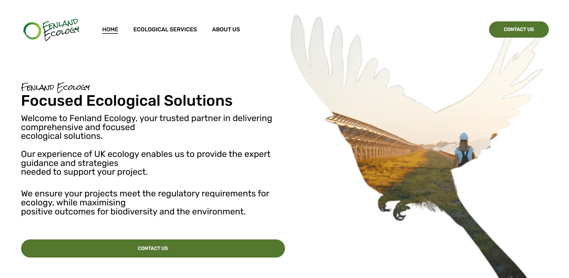
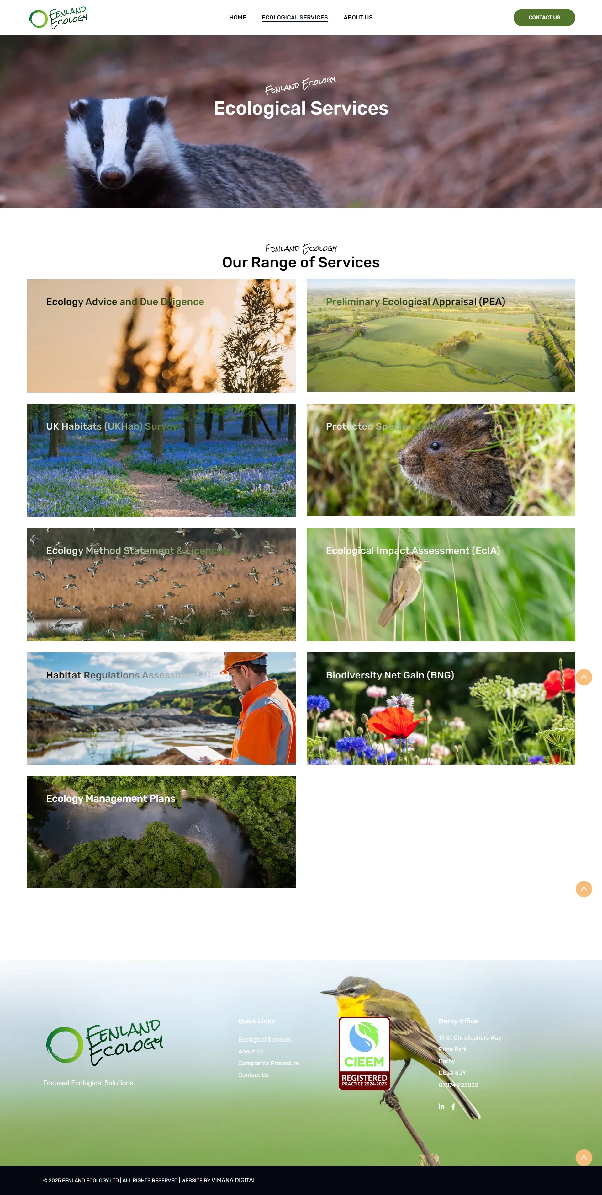
Fenland Ecology is an ecological consultancy in Derby with a long list of survey and assessment services. The brief was a contemporary, fully responsive site that made each service easy to find and easy to enquire about, with complete creative freedom on design and development. They also asked us to write all of the service-page copy.
What we did, and why it matters for this topic:
- Palette from the logo, not from a trend board. The site's greens and earth tones are drawn from Fenland Ecology's own brand, so the natural feel is theirs rather than borrowed.
- Video banners, but optimised. The client supplied the footage; we compressed and sized it to fit the design without dragging page weight up. This is the single biggest decision on a nature-led site, because video is where "organic" pages usually become 5 MB pages.
- Mixed imagery. Stock, client-supplied and visuals we created ourselves, chosen per page rather than one hero shot repeated.
- A clear service structure. Each service has its own page with a straightforward enquiry route, so the calm design never gets in the way of the job the visitor came to do.
- Built to last. The layout is designed to need few significant changes, which keeps the ongoing cost down.
Read the Fenland Ecology website case study, or see what the same approach costs for your business on our web design services page.
Thinking about a redesign? Send us your current site and we'll tell you what it weighs, how it scores for contrast, and what we'd keep. Call 0115 647 0444 or get in touch.
Which businesses should use nature-inspired web design?
It fits when the look is true. Ecology consultancies, landscapers, tree surgeons, garden designers, wellness practitioners, outdoor brands, food producers, holiday lets and eco-conscious manufacturers all have a genuine reason to look like the outdoors.
It fits less well for an engineering firm, a solicitor or an accountancy practice, where soft colours and curves can read as vague. Those businesses still benefit from the engineering half of the trend (light pages, accessible contrast, restrained motion) with a more structured visual language. The 2025 Scope research cited by AbilityNet found 48% of disabled shoppers who hit a website problem simply went elsewhere; legibility is a commercial question for everyone, not a design preference.
If you sell online to EU customers, note that the European Accessibility Act has applied since 28 June 2025 and references WCAG 2.1 AA as its technical baseline. Pretty and illegible is not an option. We built the Notts County Foundation platform around WCAG 2.2 requirements, with accessibility tools coded in-house; see quality assurance services.
A 2026 checklist before you sign off a nature-inspired design
- Home page under 1.5 MB on mobile, well below the 2.56 MB median.
- Body text passes 4.5:1 contrast against its background (free checkers exist; ask your designer to show you the result).
- Hero video, if any, is compressed, muted, lazy-loaded and has a still image fallback.
- Animation stops when a visitor's device has reduced motion switched on.
- Largest Contentful Paint under 2.5 seconds, Interaction to Next Paint under 200 milliseconds, Cumulative Layout Shift under 0.1 (Google's Core Web Vitals thresholds).
- Fonts: two families at most, served locally.
- Images in WebP or AVIF, sized for the slot they sit in.
- A plain-language service page and a visible contact route above the storytelling.
Nature-inspiredweb design:common questions
Not covered here? Call and ask. We reply within 24 hours.
What is nature-inspired web design?
Nature-inspired web design is a style that borrows from the natural world: earthy colour palettes, organic shapes, natural textures and imagery, and gentle motion. In 2026 it usually pairs with sustainable web design, which keeps pages light and energy use low, so the site feels calm and loads quickly on a phone.
Is nature-inspired web design good for SEO?
Indirectly, yes, if it is built light. Google's ranking systems use Core Web Vitals, and a minimalist, low-weight page tends to pass them. The colours and shapes themselves make no difference to rankings. A heavy "organic" site with uncompressed video can score worse than a plain one.
Are earthy colour palettes accessible?
Only if contrast is checked. Low-contrast text is the most common accessibility failure on the web, found on 79.1% of top home pages in WebAIM's 2025 study. Keep soft greens and sands for backgrounds and accents, and use dark text at a 4.5:1 ratio or better for anything people need to read.
What is sustainable web design?
Sustainable web design reduces the energy and resources a website uses: smaller images, less JavaScript, fewer third-party scripts, efficient hosting and content people actually need. The W3C's Web Sustainability Guidelines, a Group Note Draft from September 2026, set out 71 guidelines covering design, development, hosting and business decisions.
Will web design trends for 2026 date quickly?
The visual flavour will, as every trend does. The underlying practices will not: light pages, accessible contrast, respect for reduced-motion settings and clear service pages were good advice in 2020 and will be in 2030. Choose a look that is true to your business and build it on those fundamentals.
We design and build websites that are light, legible and true to the business behind them, from around £1,000. Prices exclude VAT. Tell us what you do and we'll show you how the style could work for you.
Get a quote